Project Details
Timeframe: 3 weeks
Client: Goal Makers Digital
Role: Lead Researcher
Team: Natalie Resendiz, Maddy Shack, Riley Hamilton
Tools: Figma, Pen and Paper, Google Forms, OptimalSort
Platform: Web
The Company
Goal Makers Digital is a new venture capital spawned from 30 years of consulting experience.
The Challenge
Goal Makers is aiming to design an e-learning management training course based off of the “Winning Managers Playbook” written by John Cioffi.
How might we create the ideal user flow of Master Managers so that the user can have an engaging, valuable and efficient learning experience?
The Solution
To research e-learning principles/patterns and apply them to the ideal course workflow of the Master Managers Course.
Research
Surveys
C + C Analysis
User Interviews
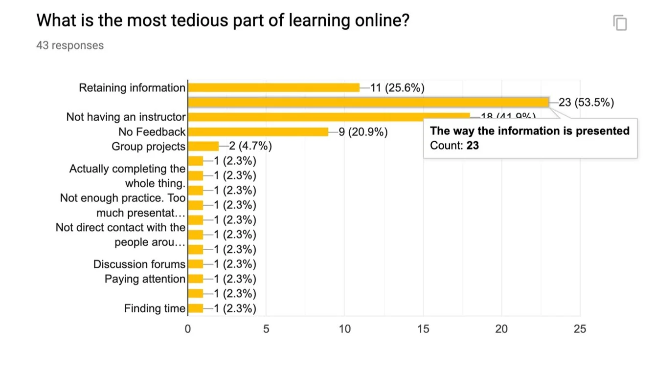
Survey Says..
To really understand our users and their experiences with learning I formulated a survey that aimed to get into the minds of users and what they had experienced previously with e-courses.
A painpoint we found in our survey that greatly impacted our design was the presentation of information. Users found this to be the most tedious part of learning online so we wanted to present information in a clear and familiar way to uncomplicate learning online.
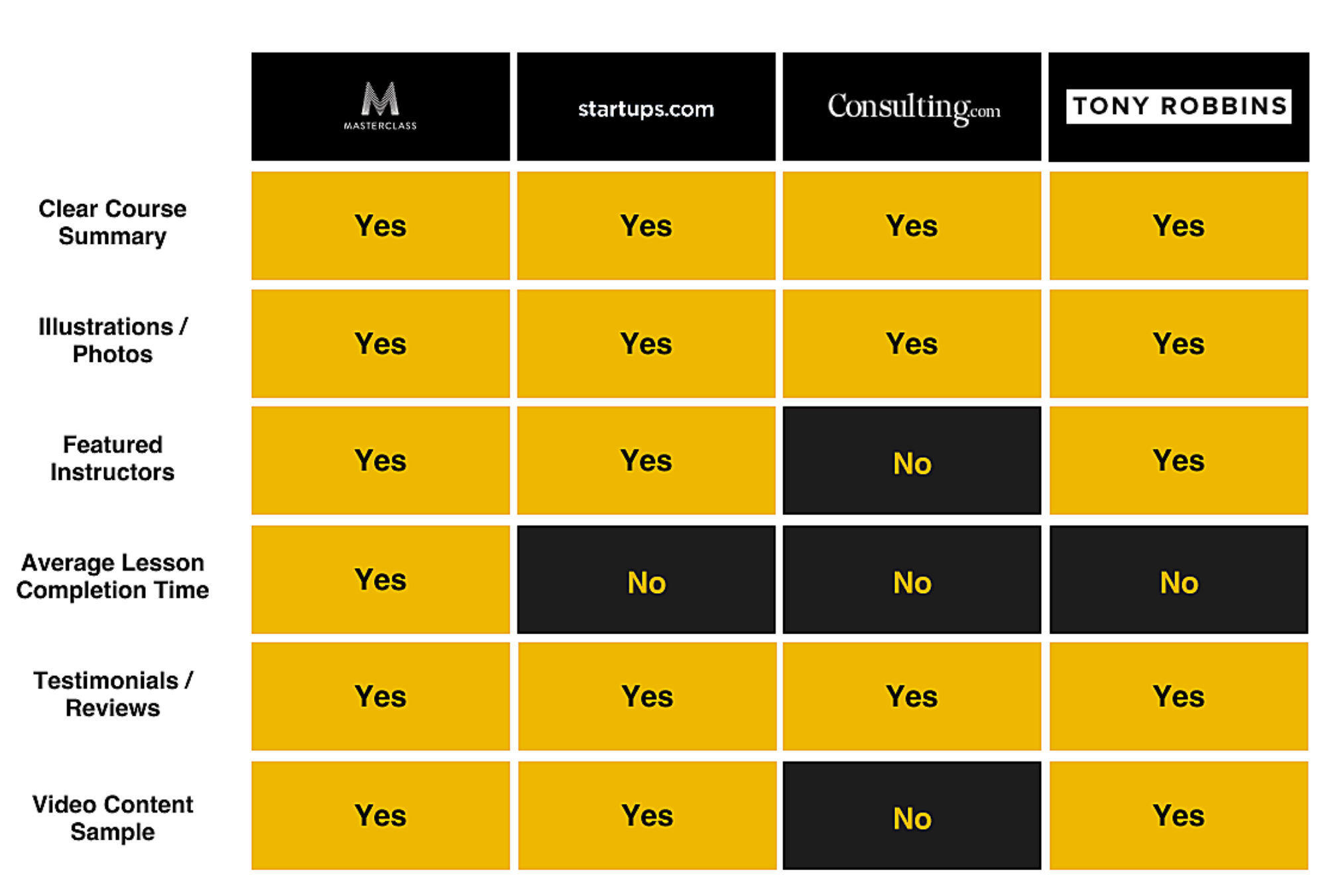
Analyzing the Competition
I conducted a C+C analysis to evaluate patterns and trends from the landing pages of our competitors. The Goal Makers landing page should showcase reputability, success, clear expectations and a face of the brand.
The landing page should do all of these things in order to market itself as a reputable course.
User Interviews to Create the frame for our Learning Course
To transfer the information from a book to an e-learning course I wanted to better understand our users.
We interviewed 9 “learners” regarding their learning experiences to understand what contributed to great learning experiences and the not-so-great experiences. We sought out to find the best e-learning practices so that we could apply them to our Master Managers course.
We interviewed 3 small-business owners regarding their previous experiences with management training to determine what they considered a requirement for a training course for their employees.
We need to present information clearly, create interactions with the course, and provide structure.

“I found it required a lot of self-management, which was challenging for me. ”
“Make sure they know what to expect of you and make sure you set your expectations.”


“If it’s an institution then it’s reputable automatically or customer reviews. ”
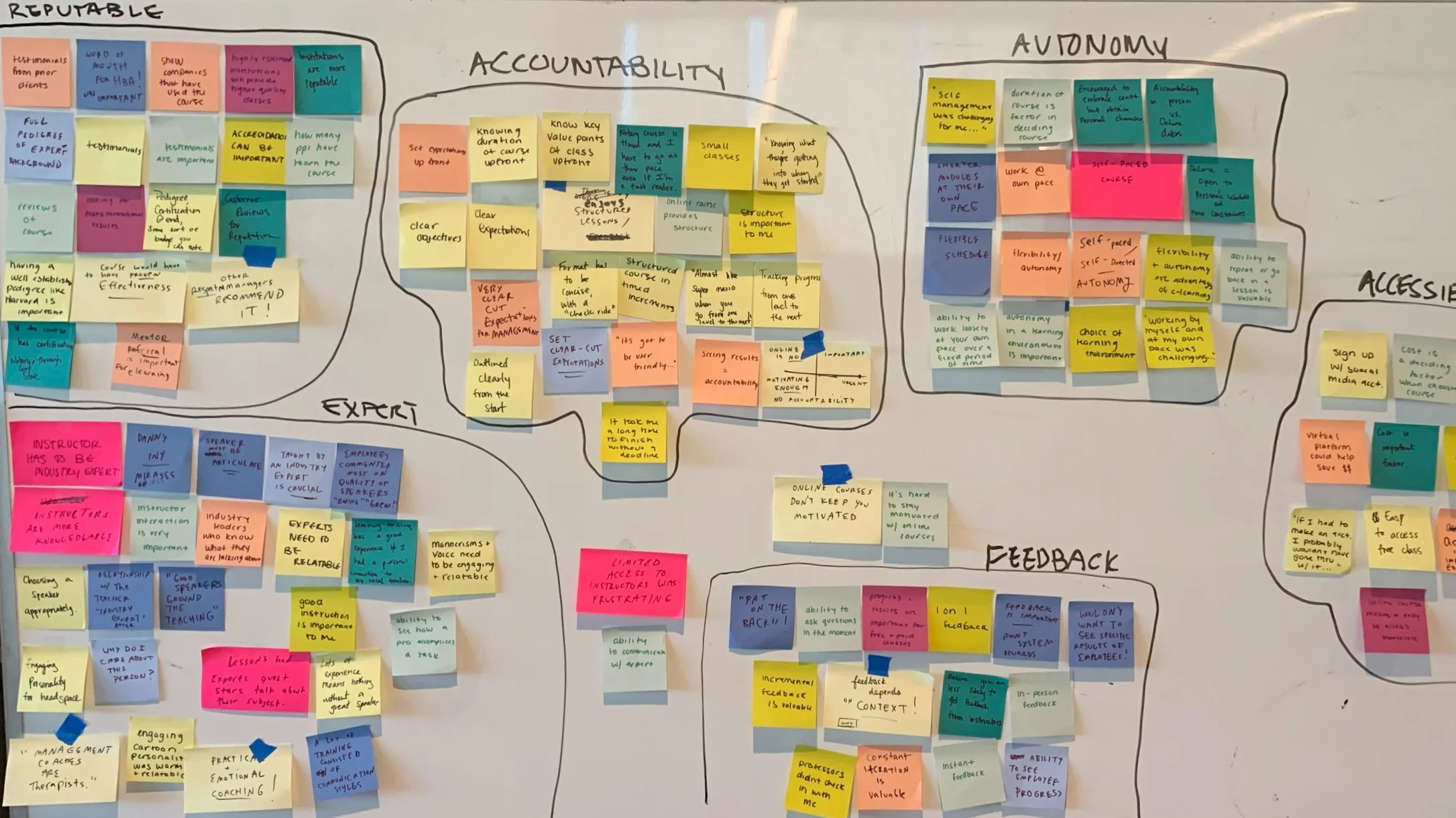
Synthesis
Affinity Mapping
Personas
Affinity Mapping
Gathering our insights from our target markets ( “Bosses” and “Learners,”) we then synthesized our data for both groups together in an affinity map to find what both types of users wanted from the Master Managers course.
We found the top 3 insights for both groups:
I need to know the course is reputable.
I need a personable and engaging industry expert.
I want clear expectations in order to hold myself (or employees) accountable.
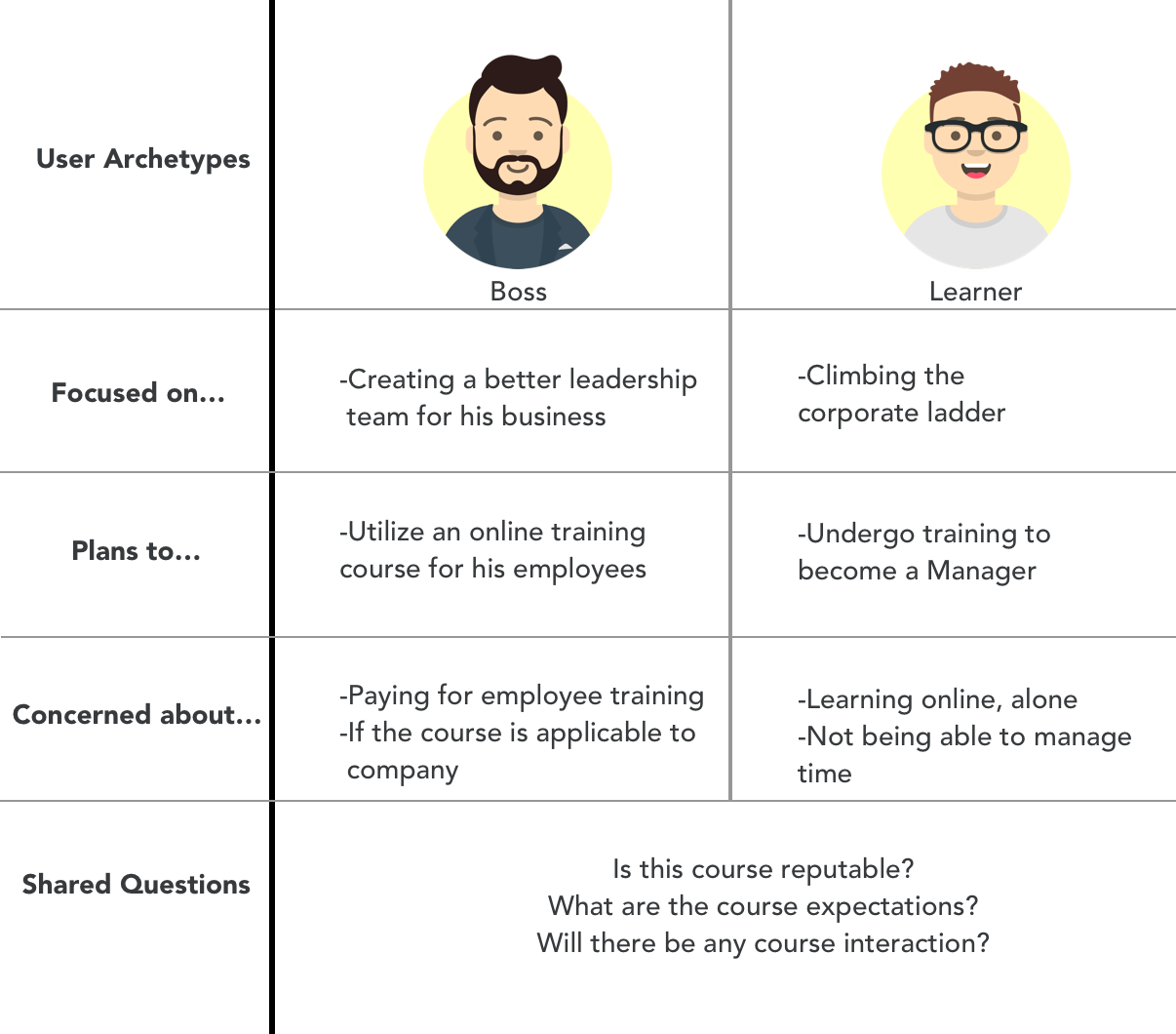
Our Types of Users
Utilizing these insights we found that there were two users our product was designed for our Bosses and Learners. We developed a user archetype consisting of the needs and behaviors of both users.
Ideation
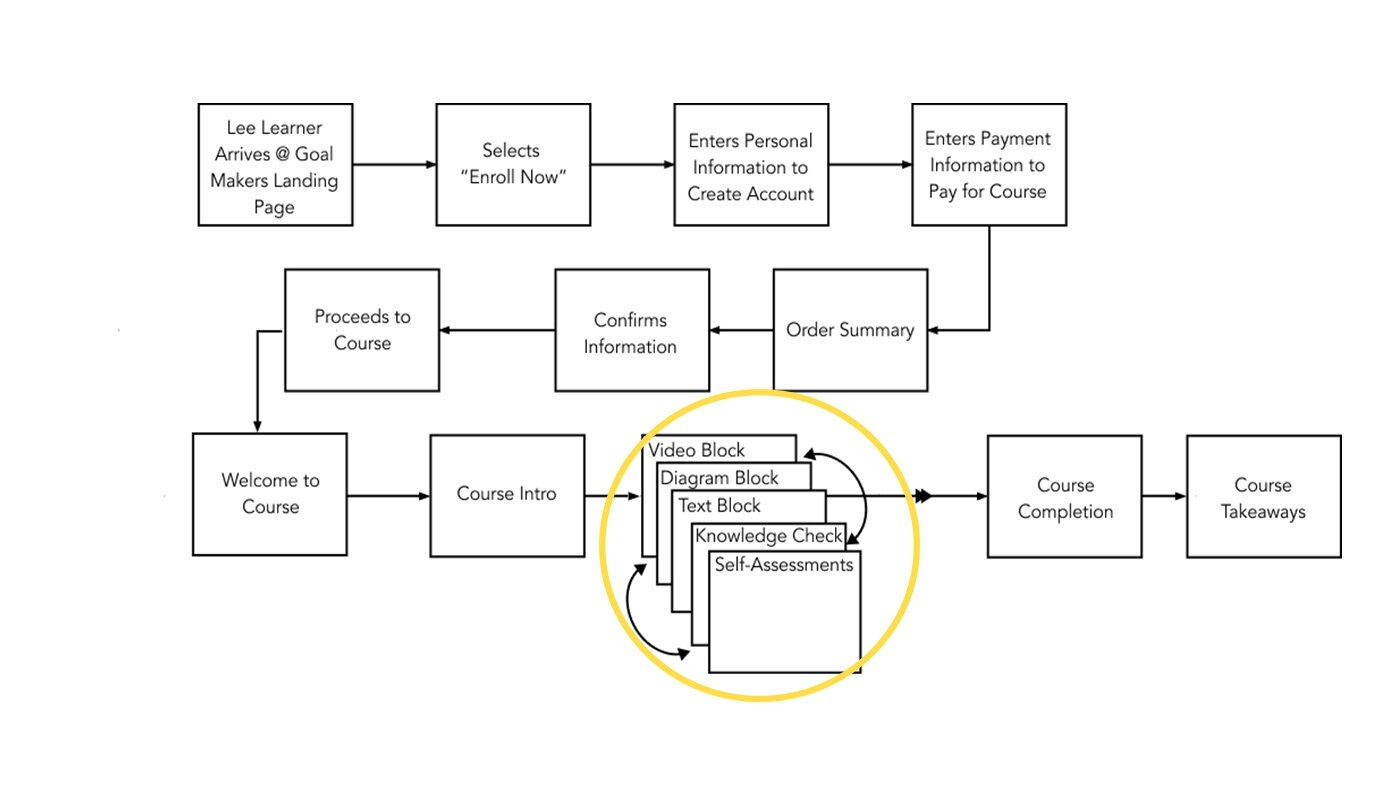
User Flow
User Flow Challenge
We were also able to create the ideal user flow for the Learner to go through his Master Managers course. This user flow needed to be applied to a third party platform which was a challenge presented to us by our clients. We were able to create interchangeable “Blocks” that would vary the content which was important to users.
Design
Wireframes
Prototype
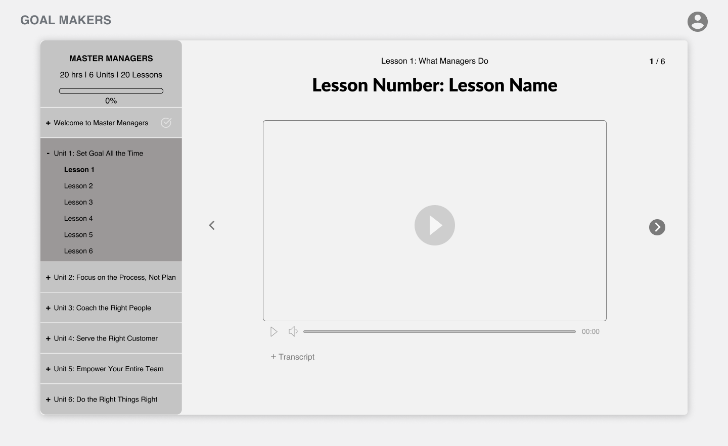
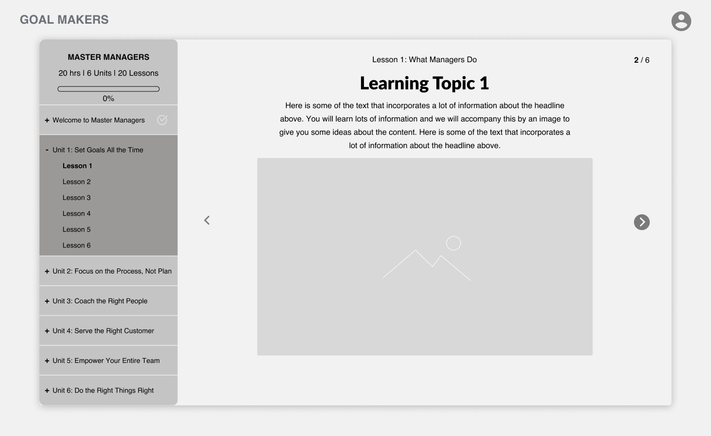
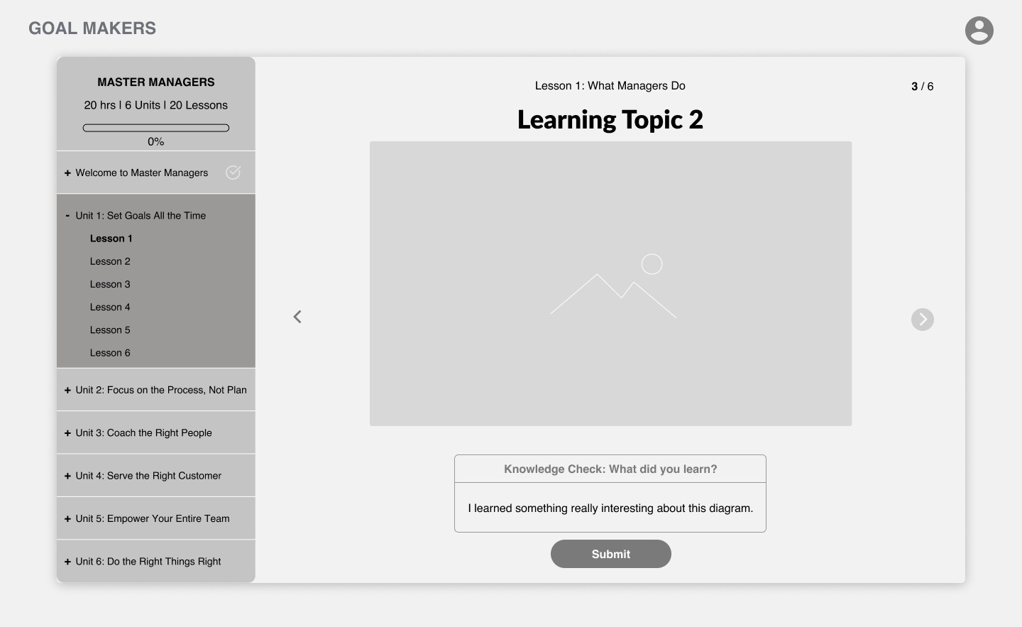
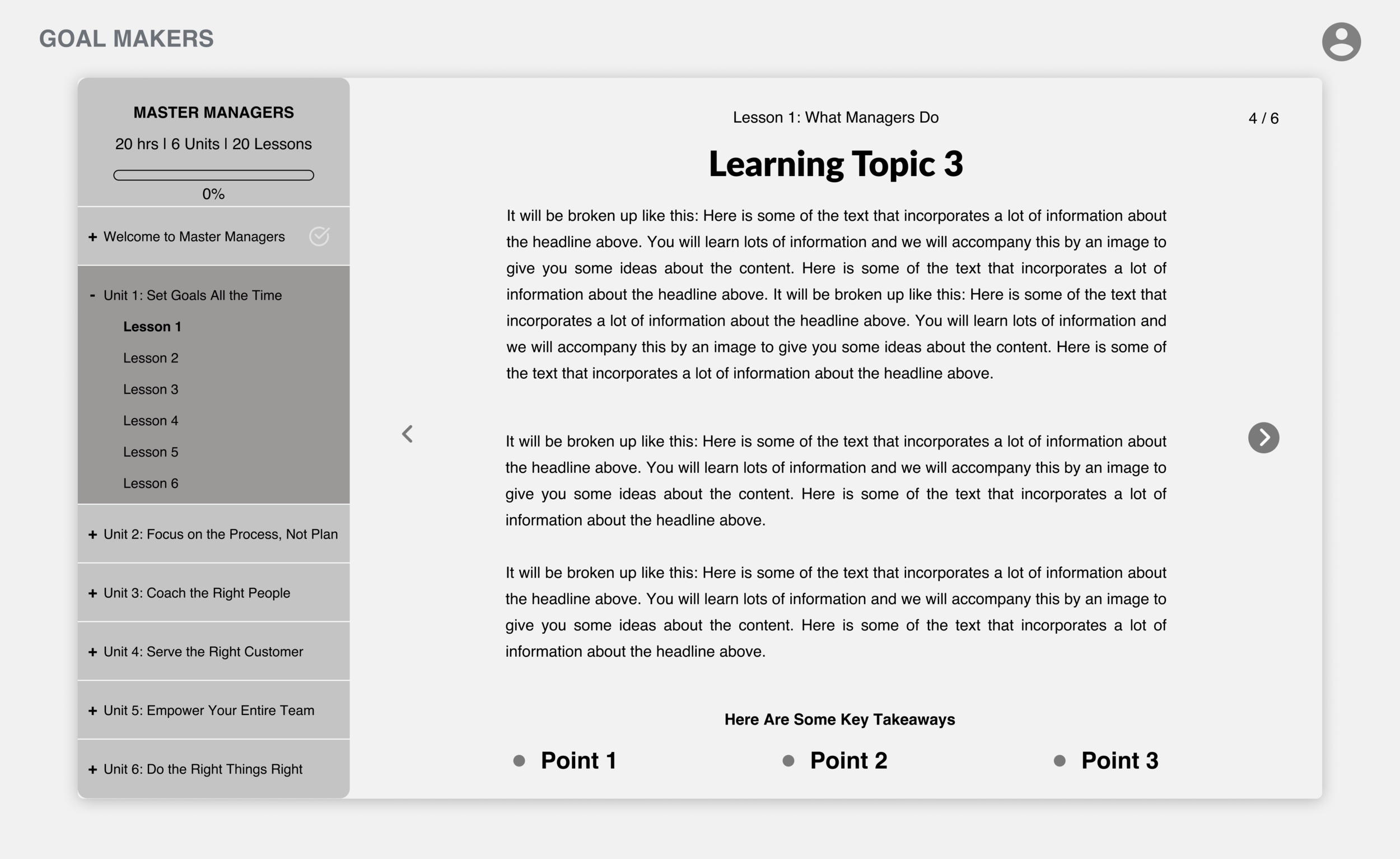
The Evolution of Designing Learning Blocks
Users stated that the wanted interaction with the course, the content and the instructors. They wanted a sense of community and clear expectations throughout the course.
These learning blocks are interchangeable as our users need varied content but a common structure. Video blocks, text blocks, diagram blocks and incremental feedback all become a part of the users flow through the course.
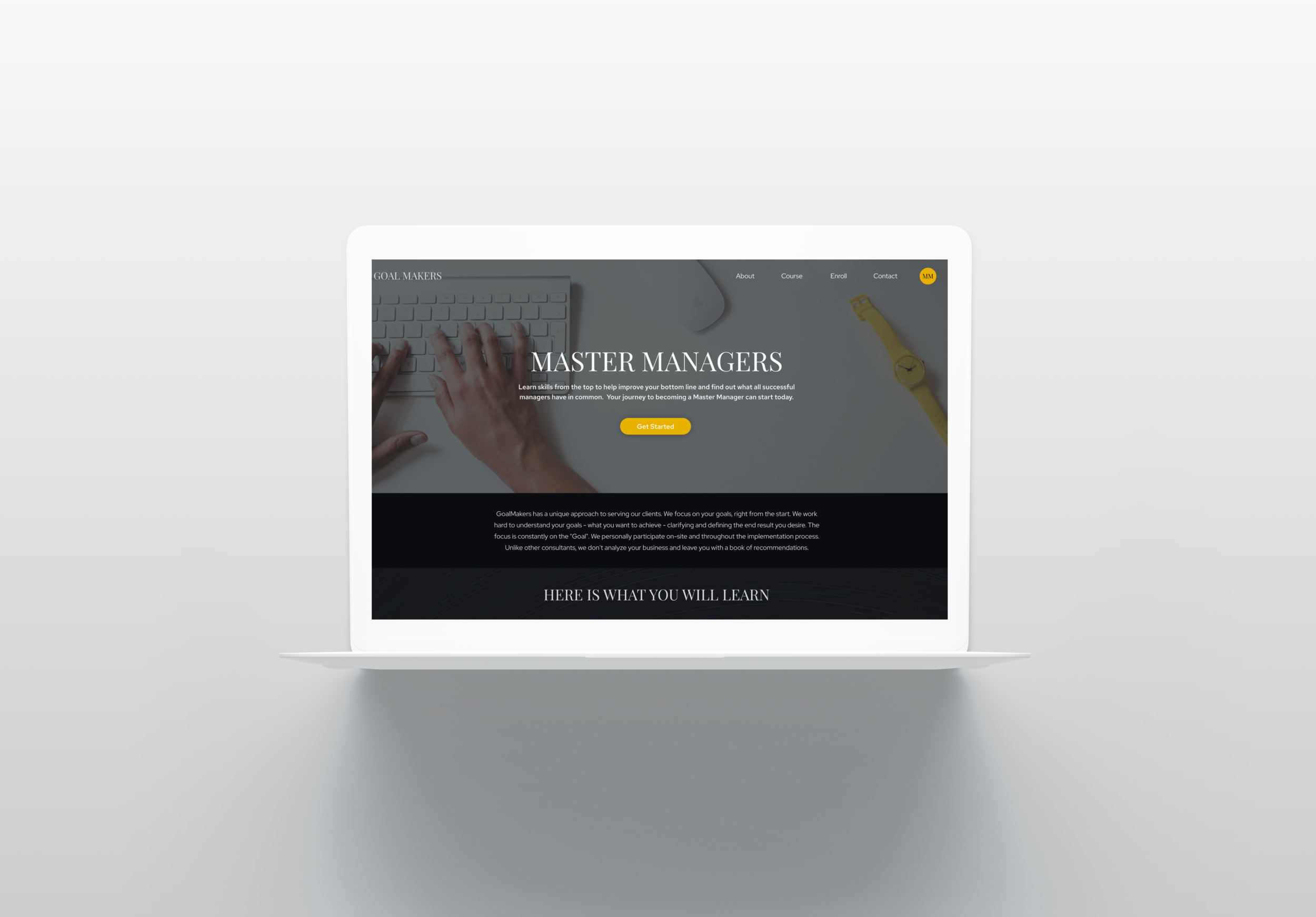
Marketing for Our Bosses
Through our user research we found that our landing page was important to market to our “Boss” archetype, this annotated wireframe explains the research behind our choices and ways we clearly structured our navigation to the course.
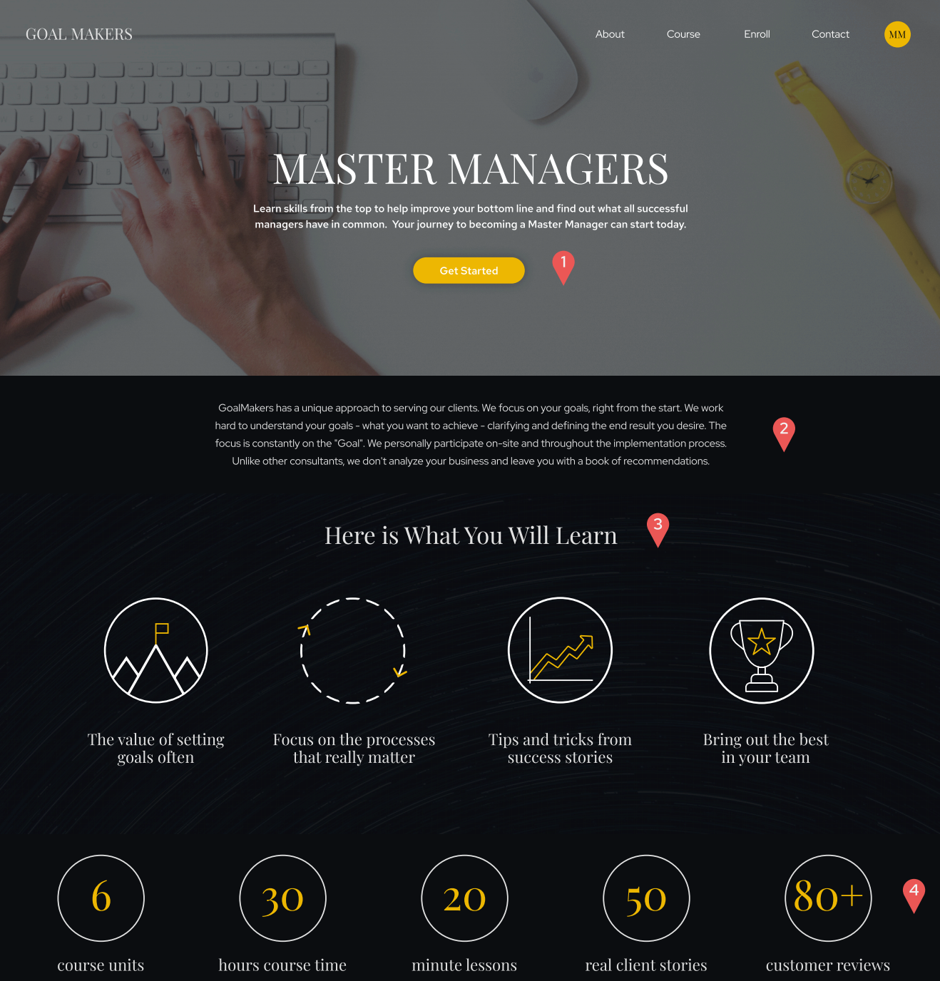
1. Clear CTA centrally located at top pf page to allow users to easily sign up for Master Managers. E-learning course competitors all have an enticing hero image with a clear call to action at the top of the page.
2. Here’s space to provide a little more information up front about what makes Master Managers unique.
3. Users want clear course objectives upfront.
4. Users want a high level overview of stats on the course and what it has to offer.
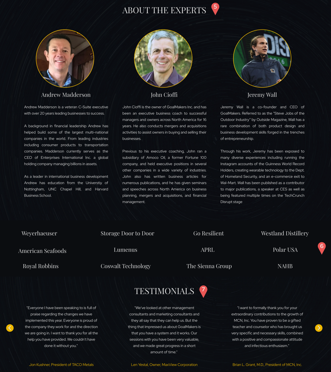
5. Users want to know who the experts are. They want experts who are relatable and have demonstrated, relevant experience.
6. Users want to see reputability clearly on the homepage by seeing what clients have benefited from this expertise.
7. Users want to know that a course is reputable. This can be demonstrated through reviews and testimonials.
Prototype
Next Steps
Test the Master Manifesto
Create more courses
Quantify the results of our master managers course
My time on the goal makers project was pretty impactful. I was able to learn more about myself as a ux designer, I gained new skills in mediating between my team members and showed my leadership skills as lead researcher. The design process is iterative and continuously evolving based on your user findings. Rolling with the punches in UX Design is also important especially when it comes to client challenges.